Why build another timer?
There are lots of Pomodoro apps, but very few of them are pleasant to have in your peripheral vision all day, and almost none of them give you the choice to set a timer or a stopwatch. As someone who likes one for certain tasks, and one for other tasks, having both in one place was a convenient feature for me.
I wanted to build something that had a presence, that made a mundane utility feel a little bit less mundane. I first had the idea for the eyes that followed the cursor, humorously watching you to check you're doing what you planned to do when you set the timer. After this, everything else was built around them.
The aesthetic-usability effect [1] says people perceive attractive designs as easier to use. As my goal was to help people keep the timers running and stay on track - the charm became the feature.
Eyes that tell a story
The menu bar icon has various states, each serving a purpose. NN/g's first usability heuristic is visibility of system status [2] - the system should always keep the user informed about what's going on. Most menu bar timers do this with a number. Mine does it with a number and a character you can read at a glance from the corner of your eye.
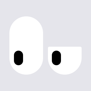
The closed arcs mean nothing's running, the timer is 'asleep'. Open eyes tracking the cursor mean the clock's ticking. Wider eyes and a green icon mean your time is nearly up.
Design decisions
Jakob's Law states that people spend most of their time using digital products other than yours [1]. No one wants to learn a whole new user experience for a simple timer app, so I allowed established industry conventions to lead the design. I set out to make the experience as fast and intuitive as possible, so the users would spend as little time within the app as necessary.
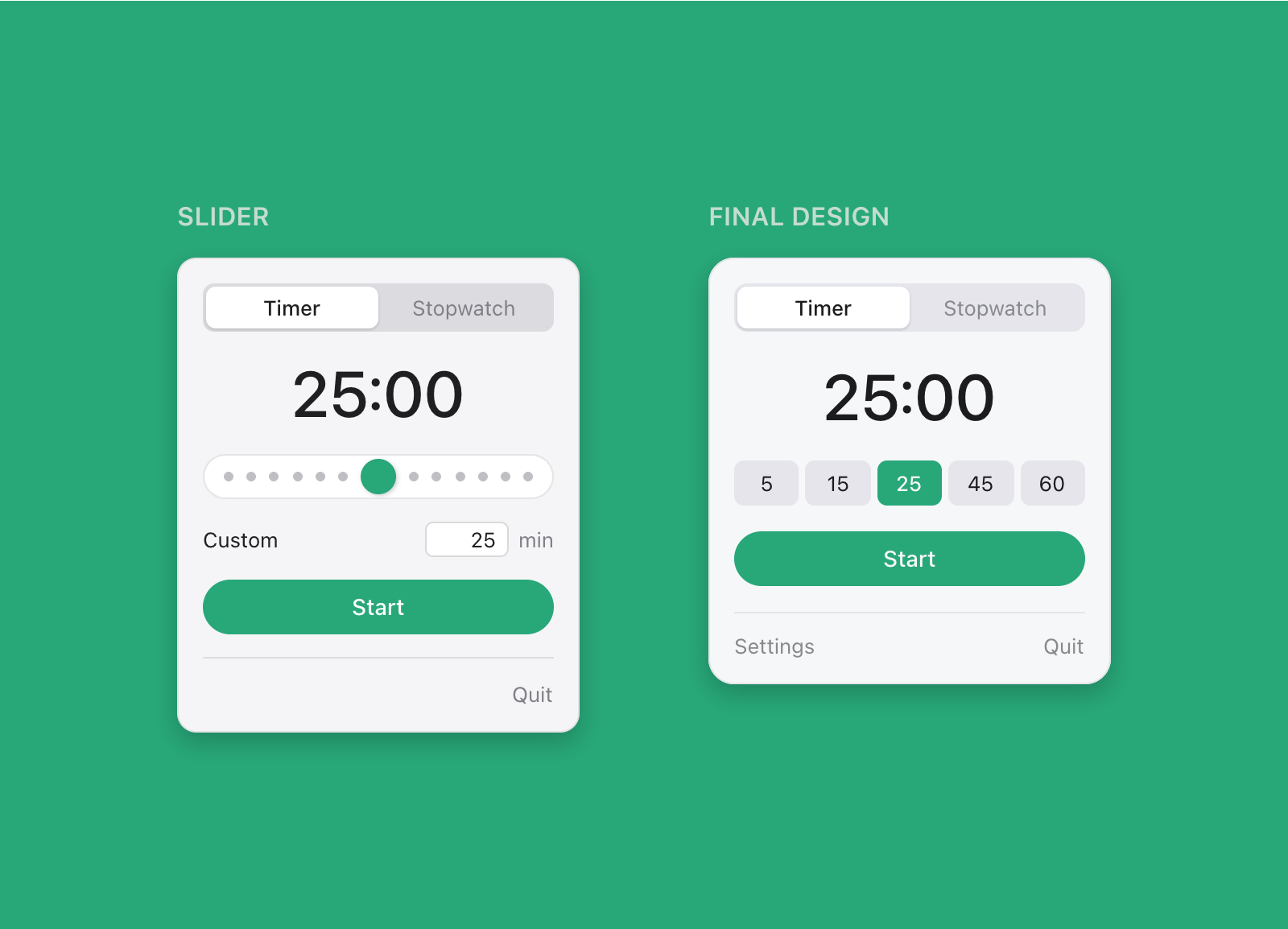
The key feature of the app, setting the time for a timer, took a few iterations to get right. Initially, I tried to stray off-piste slightly and implement a slider system, but I dropped it for two reasons.
- A slider is the wrong control for the data. Sliders are for continuous ranges where approximate is fine (volume, brightness, opacity). When people set a timer, they usually have a discrete value already in mind.
- The numbers didn't work. Five-minute increments up to ninety minutes is eighteen stops on a slider - each being a small, imprecise target. Fitts' Law states that the time to acquire a target is a function of the size of the target [1]. A slider with small targets slows the user down, creating friction and frustration.

So, five preset buttons were chosen instead. Each was large enough to click without having to aim, and they covered the durations most people would actually use. Custom durations still needed their place, though. That became the thing I was most unsure about, so I tested it.
Testing
I tested two people on a working build using task-based sessions phrased as goals, not instructions - "start a timer for 25 minutes", not "click the 25 button".
The task I cared about most was "now set a timer for 17 minutes". Custom durations are set by clicking directly on the time display, which highlights on hover. I'd flagged this to myself as a risk before testing. It's clean, but it's an invisible affordance (a feature that lets the user perform an action, but provides no visible cue to show it exists).
The click-to-edit feature was found, but not immediately. Users weren't initially sure the time could be adjusted manually, but both found the hover state after a little exploration and immediately understood that it was editable. I left it as-is, because I reasoned that the discovery cost was a one time cost. Once you know, you never un-know it. The app would likely be used daily by a person for long periods of time. A few-seconds of first-run friction for a permanently cleaner interface was a worthy trade. For an app used once by strangers, this would be the wrong call.
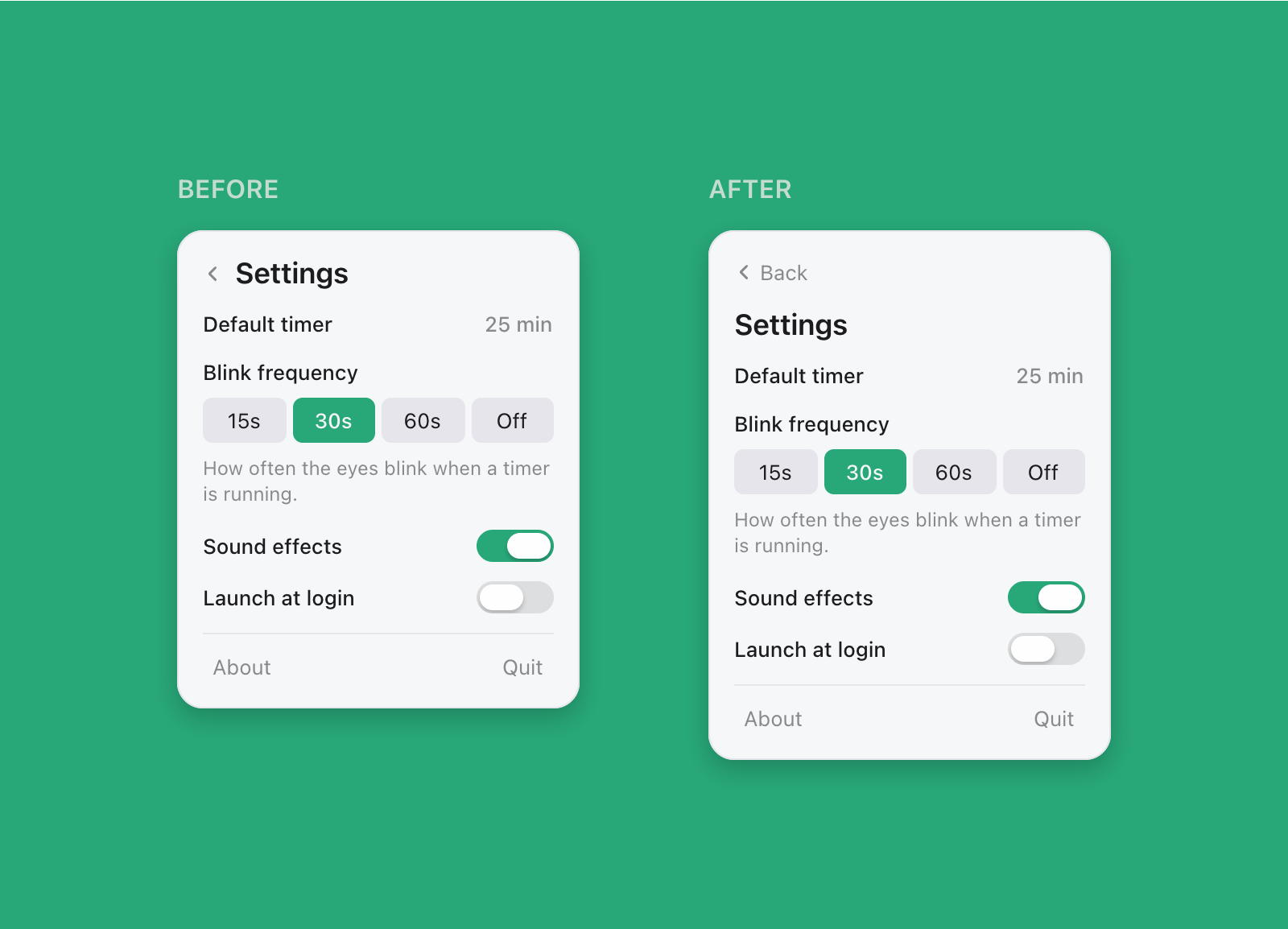
Another improvement I found through testing was the improvement of the back button. I initially went with a chevron next to the title, but users struggled with it (shown below). It was too small and icon-only, a direct failure of Fitts' Law. Enlarging the hit area and adding "back" alongside the icon solved this problem.

Two participants isn't enough to say anything about how often a problem occurs, but it was enough to find that problems exist. Next time, I would record Single Ease Question scores per task to give me quantitative comparisons rather than just two qualitative accounts. For now, I've implemented a quick feedback feature within the app for users who have any comments.
What shipped
- Eyes track the cursor across multiple displays, computed per-eye, so they converge on a nearby cursor and run parallel on a distant one.
- Cursor position is read from a public API that needs no accessibility grant, so zero obtrusive permissions are required on first launch.
- The animation clock stops completely when the timer isn't running, so there's effectively 0% CPU usage when idle.
- Monospaced digits ensure that the menu bar doesn't shift every second, moving other icons sideways.
Some decisions were based on UX heuristics, others on performance. A menu bar app that drains battery or makes your icons jitter gets uninstalled regardless of how well-designed the popover is. The app was designed in Paper, and built with Swift and SwiftUI using Claude Code. Thanks for reading, and feel free to download it below!
References
[1] Laws of UX
[2] NN/G's 10 Usability Heuristics for User Interface Design