Typography is one of the key design decisions that determine how an app or website performs. Most users couldn't define it, but they'll instantly feel when it's wrong. It's something we're always noticing and subconsciously judging.
Consider the two versions of the same app below (CashApp). There are a few subtle difference that make one 'feel' better than the other. Take a moment to decide which, and why.
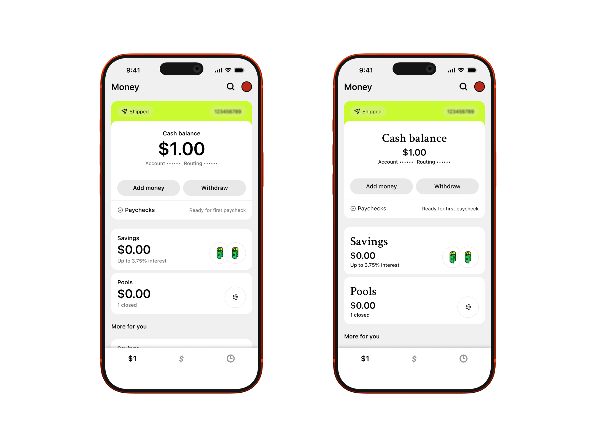
I think you'll agree that the version on the left is better, but why?
- The left uses more considered hierarchy, achieved through different fonts (size and weight) and colours. These guide your eyes naturally through the page. For instance, the larger values placed beneath the smaller titles lets regular users find the key information faster - they already know what they're looking for (described by the titles).
- The version on the right utilises two fonts which don't complement each other particularly well. Without knowing it, the switching back and forward between them gives your brain one more thing to process, making for a subtly less comfortable experience.
- Finally, the version on the right uses just one font colour, solid black. Here you lose the ability to make secondary information skippable. In the left version, the grey text can be read by users who want the extra information, but it's also easy for the user to skip past it if they already have what they need from the page.
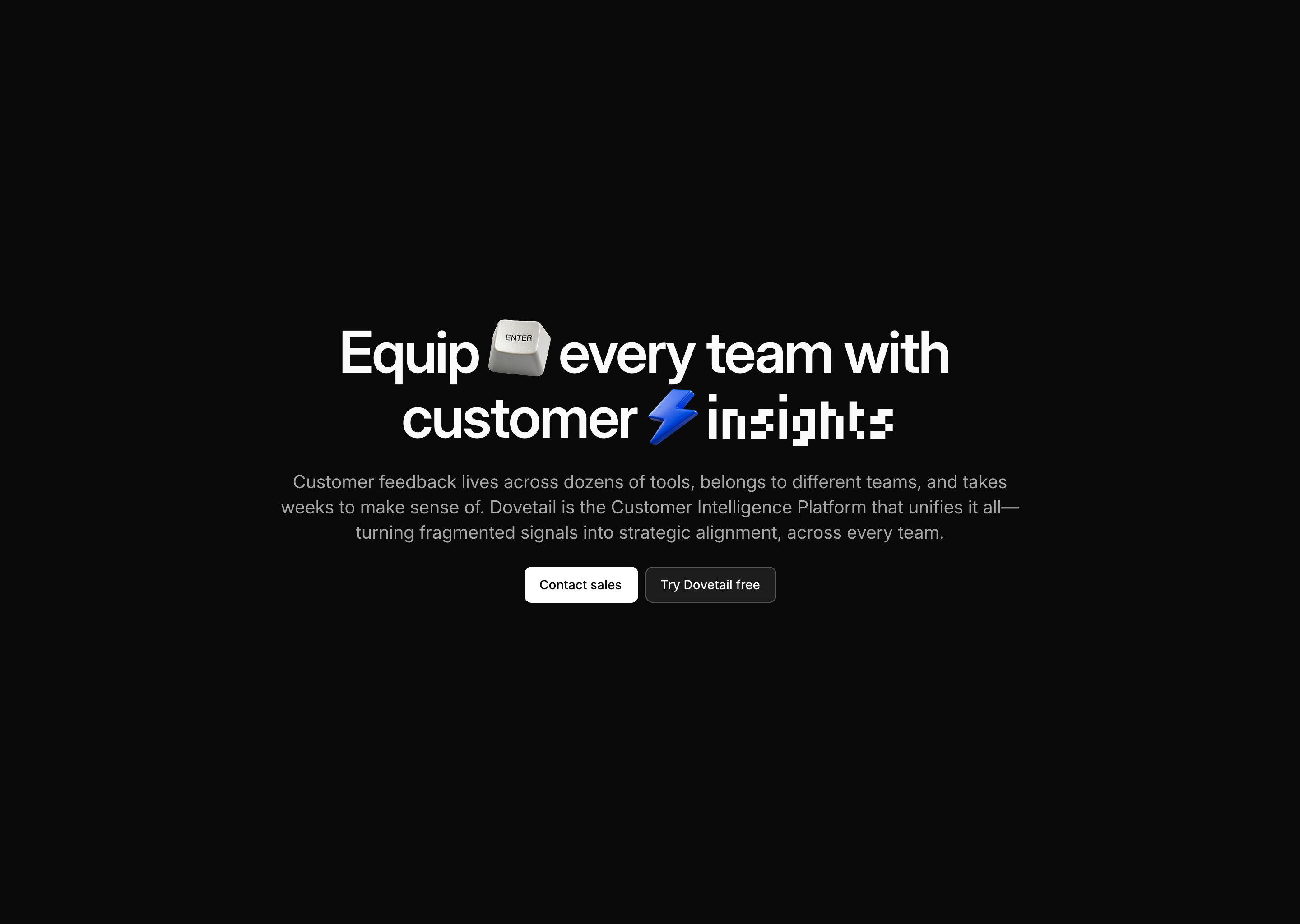
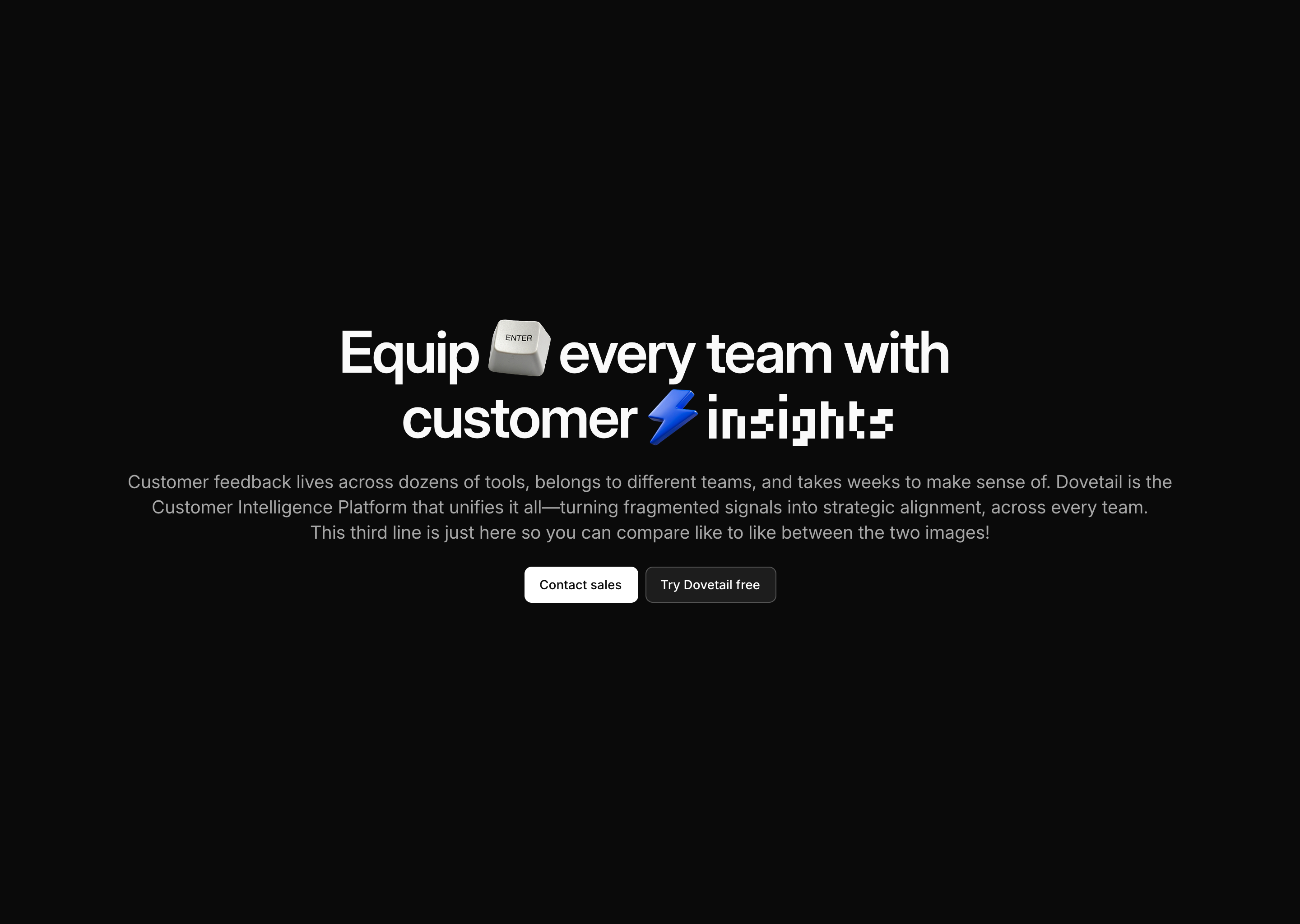
Another typography decision is measure (often referred to as line length). It defines how many characters sit on one line of text. Too short, and the reader will find it hard to get into a flow due to constantly having to switch to new lines. Too long, and they'll find it hard to get back to the start of the next line, which is now too far away.
The website sections below (from Dovetail) show the impact of keeping the line length to between 45 and 75 characters long - generally considered a best-practice for most scenarios. If you read through the informative text below the heading, you'll likely find the second version just a little bit harder to read. Your eyes have got to move all the way across the page between lines, and find their way to the correct position on the next one.
Typography is made up of an almost endless number of variables. Whilst in this article I've covered just a few, I hope it's a bit clearer why it's so important in any design. It's one of the fastest and first signals of whether something was made with care. Next time you see an app or website you really like (or dislike), consider what impact the typography is having.
References
- Interface Craft by Josh Puckett.
- Baseline Design Course.